Goodreads Redesign
Problem
The current user interface of the Goodreads app lacks intuitive navigation and usability, resulting in frustration and inefficiency for users attempting to discover, track, and engage with books and community features. Users struggle to find key functionalities such as book recommendations, reading progress tracking, and community interactions due to unclear navigation pathways and cluttered interface elements. As a result, user engagement and satisfaction levels are suboptimal, hindering the app's ability to serve as a comprehensive platform for book lovers.
Goals
Elevate Branding
Aside from the sepia color scheme and occasional appearances of the logo on the app icon and loading screen, there is a lack of clear brand identity throughout the app.
Reduce Clutter
Some pages of the Goodreads app have a lot of elements that feel unnecessary or distracting, making it difficult for users to navigate.
Improve Functionality
Compared to competing apps like StoryGraph, Goodreads falls behind with its discovery and filtering systems.
Sketches

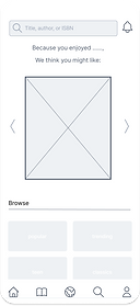
Wireframes


Prototypes


Clickable Prototype